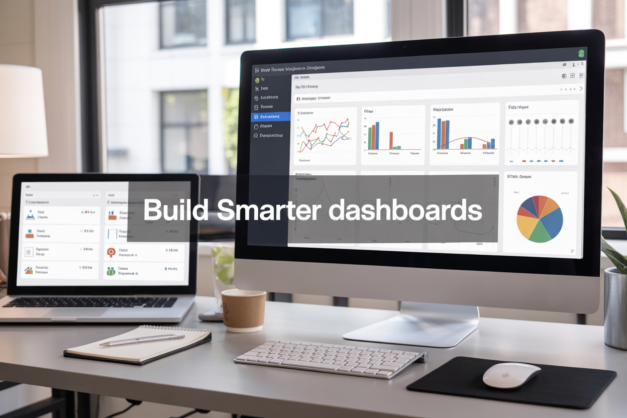
Slow-loading Tableau dashboards and messy workbooks kill productivity and frustrate users. This guide shows Tableau developers, business analysts, and data teams how to build faster, more organized dashboards through proven Tableau naming conventions and dashboard performance optimization strategies.
You’ll discover how to establish consistent Tableau naming standards that make your workbooks easy to navigate and maintain. We’ll also dive into data source optimization techniques that dramatically reduce dashboard load time improvement, plus share advanced Tableau performance tuning methods that keep your visualizations running smoothly even with large datasets.
Establish Consistent Tableau Naming Conventions for Better Organization

Create Standardized Field Naming Patterns That Improve Readability
Well-structured Tableau naming conventions start with clear, descriptive field names that anyone on your team can understand at a glance. Your field names should tell a story about the data they contain, making it easy for new users to jump into existing workbooks without confusion.
Start by establishing a consistent format for your field names. Use descriptive prefixes that indicate the field type: “Calc_” for calculated fields, “Param_” for parameters, and “Filter_” for filter-specific fields. This simple system helps users quickly identify what they’re working with when building visualizations.
Keep your naming patterns clean by avoiding abbreviations that aren’t universally understood. Instead of “Cust_Acq_Date,” use “Customer_Acquisition_Date.” While slightly longer, this approach eliminates guesswork and reduces the learning curve for new team members.
Consider implementing consistent separators throughout your field names. Choose either underscores or spaces and stick with that choice across all workbooks. This consistency makes your dashboards look professional and helps users predict field names when creating calculations or filters.
Date fields deserve special attention in your naming convention. Include the granularity directly in the name: “Order_Date_Year,” “Sales_Date_Month,” or “Transaction_Date_Daily.” This clarity prevents confusion when users are selecting the right temporal field for their analysis.
Implement Worksheet and Dashboard Naming Hierarchies for Easy Navigation
Your worksheet naming strategy directly impacts how efficiently users can navigate complex Tableau workbooks. Create a logical hierarchy that groups related sheets together and makes the workbook structure immediately apparent to anyone opening the file.
Start each worksheet name with a two-digit prefix that indicates its position in your analytical flow: “01_Data_Preparation,” “02_Sales_Overview,” “03_Regional_Breakdown.” This numbering system keeps worksheets in logical order even as you add new content over time.
Use descriptive names that clearly indicate the worksheet’s purpose and primary metric. Instead of generic names like “Sheet1” or “Chart,” opt for specific titles like “Monthly_Revenue_Trend” or “Customer_Satisfaction_by_Region.” These names help users find the right worksheet quickly when they need to make updates or reference specific visualizations.
Group related worksheets using consistent prefixes. For example, all exploratory analysis sheets might start with “Explore_” while finalized dashboard components use “Dash_” prefixes. This system helps users distinguish between work-in-progress content and production-ready visualizations.
Dashboard names should reflect their intended audience and use case. “Executive_Sales_Summary” immediately tells users this dashboard serves leadership needs, while “Daily_Operations_Monitor” indicates an operational tool. This clarity helps users select the right dashboard for their specific requirements.
Develop Data Source Naming Protocols That Scale Across Teams
Scalable Tableau naming standards require thoughtful data source naming that works across departments, projects, and time periods. Your naming protocol should make it easy for anyone in the organization to identify the right data source for their analysis needs.
Include key metadata directly in your data source names: environment, refresh frequency, and data scope. A name like “Production_Sales_Daily_2024” immediately tells users they’re working with current production data that refreshes daily and covers the current year’s sales information.
Establish clear naming patterns that distinguish between different data environments. Use prefixes like “Prod_” for production data, “Dev_” for development sources, and “Test_” for testing environments. This system prevents users from accidentally building dashboards with development data that might not reflect actual business metrics.
Consider your data refresh patterns when naming sources. Include refresh frequency indicators: “Weekly_,” “Daily_,” or “Real_Time_” to help users understand data freshness expectations. This information helps dashboard builders set appropriate expectations with stakeholders about data currency.
Regional or departmental data sources need clear identifiers that prevent confusion. Instead of generic names, use specific identifiers like “Sales_NA_Region” or “HR_Global_Metrics.” This specificity becomes critical as your organization grows and multiple teams create their own data sources.
Design Calculated Field Naming Standards That Clarify Business Logic
Calculated fields often contain complex business logic that needs to be immediately understandable to other team members. Your naming standards should make the calculation’s purpose and output format crystal clear without requiring users to examine the underlying formula.
Start calculated field names with clear action words that describe what the calculation does: “Calculate_,” “Count_,” “Filter_,” or “Convert_.” This approach makes the field’s function obvious and helps users understand whether it’s performing aggregation, transformation, or logical operations.
Include the output format in your calculated field names when it’s not obvious from context. Names like “Revenue_Millions” or “Growth_Rate_Percent” immediately tell users what format to expect in their visualizations. This clarity prevents formatting confusion and makes dashboard building more efficient.
For complex business calculations, include key logic indicators in the field name. A calculation called “Qualified_Lead_30Day_Window” tells users this field identifies leads that meet qualification criteria within a specific timeframe. This descriptive approach reduces the need for extensive documentation and comments.
Consider version control in your calculated field naming when business logic evolves. Use suffixes like “_v2” or “_Updated” to distinguish newer versions while keeping historical calculations available for comparison. This system helps maintain dashboard integrity while allowing for business rule updates.
Optimize Data Source Performance Through Strategic Structure

Reduce data extract size by eliminating unnecessary fields and rows
Data source optimization starts with being ruthless about what data actually makes it into your Tableau extracts. Every unnecessary field and row adds bulk to your extract file and slows down dashboard performance. Start by auditing your data sources and removing any columns that don’t contribute to your visualizations or calculations.
When working with large datasets, you’ll often find columns like internal IDs, audit timestamps, or legacy fields that serve no purpose in your dashboard. These fields might seem harmless, but they consume memory and processing power. Create a checklist of required fields for each dashboard and stick to it religiously.
Row-level filtering during extract creation can dramatically reduce file sizes. If your dashboard only needs data from the last two years, don’t include historical records going back a decade. Set up intelligent date filters that automatically exclude outdated information. Similarly, if you’re building region-specific dashboards, filter out irrelevant geographic data at the source level.
Consider creating purpose-built extracts for different dashboards rather than using one massive extract for everything. A sales dashboard might need different granularity than an executive summary, so tailor each extract to its specific use case.
Leverage data source filters to improve query speed
Data source filters act as the first line of defense against slow queries by reducing the amount of data Tableau needs to process. Unlike regular filters that apply after data loads, data source filters work at the extract level, meaning less data moves through your system from the start.
Context filters work similarly but apply to the worksheet level. Use these strategically when you need to filter data before other calculations run. For example, if you’re analyzing current year performance, set the year as a context filter so all subsequent calculations only work with relevant data.
Quick filters on dashboards look convenient, but they can hurt performance if not implemented thoughtfully. When users interact with quick filters, Tableau recalculates everything downstream. Instead of showing all possible filter values, use cascading filters or limit options to the most commonly used selections.
Server-side filtering becomes crucial when working with live connections. Push as much filtering logic back to your database as possible since databases are typically optimized for these operations. Write custom SQL that includes WHERE clauses rather than letting Tableau pull everything and filter afterward.
Choose optimal data connection types for your specific use case
The choice between live connections and extracts significantly impacts dashboard performance, and there’s no universal right answer. Live connections work well when you need real-time data and have a robust database infrastructure that can handle concurrent queries without breaking down.
Extracts shine when you’re working with complex calculations, large datasets, or when your source system can’t handle multiple simultaneous queries. They also provide better performance for interactive dashboards where users frequently change filters or drill down into data.
| Connection Type | Best For | Performance Considerations |
|---|---|---|
| Live Connection | Real-time reporting, strong database infrastructure | Query speed depends on source system |
| Extract | Complex calculations, interactive dashboards | Faster queries but requires refresh scheduling |
| Hybrid | Mixed requirements | Combines benefits but adds complexity |
Cloud-based data sources like Snowflake or BigQuery often perform better with live connections due to their ability to scale computing resources dynamically. On-premise databases might benefit more from extracts, especially if network latency becomes an issue.
Consider your refresh requirements when making this decision. If stakeholders can work with data that’s a few hours old, extracts provide better user experience. For real-time monitoring scenarios where every minute counts, live connections become necessary despite potential performance trade-offs.
Incremental extracts offer a middle ground for large datasets that change regularly. Instead of refreshing entire extracts, you can append new data and update changed records, reducing both processing time and system load.
Enhance Dashboard Load Times with Smart Design Choices

Minimize the number of worksheets and data sources per dashboard
Keeping your dashboard lean means being selective about what you include. Each additional worksheet adds processing overhead, and multiple data sources create extra complexity that slows everything down. Think of your dashboard like a car – the more weight you add, the harder the engine has to work.
Start by asking yourself if each worksheet truly adds value. Sometimes three smaller charts can be combined into one more effective visualization. When you do need multiple worksheets, consider using dashboard containers to organize them efficiently without creating unnecessary clutter.
For data sources, aim for a single primary connection whenever possible. If you absolutely need multiple sources, make sure they’re properly related and optimized. Each additional data source means Tableau has to manage separate connections, which directly impacts dashboard load time improvement.
Replace complex calculations with pre-aggregated data when possible
Heavy calculations performed on-the-fly during dashboard rendering can kill performance. Instead of making Tableau do the math every time someone opens your dashboard, push those calculations upstream to your data preparation phase.
This approach works especially well for:
- Running totals and cumulative calculations
- Complex date logic and fiscal year calculations
- Advanced statistical computations
- Multi-level aggregations
Pre-aggregated data means your dashboard can focus on displaying information rather than computing it. Your database or ETL process can handle these calculations more efficiently than Tableau’s visualization engine.
Use dashboard actions instead of multiple filters to reduce processing load
Dashboard actions are like having a smart assistant instead of multiple demanding bosses. When users click on a mark in one visualization, actions can filter other views without requiring separate filter controls that constantly query your data.
Actions reduce the number of filter objects Tableau needs to manage and minimize the queries sent to your data source. Instead of having five dropdown filters that each trigger their own data requests, one well-designed action can accomplish the same filtering with a single interaction.
Set up highlight actions for quick comparisons and filter actions for drilling down into details. This creates a more intuitive user experience while boosting performance behind the scenes.
Implement incremental refresh strategies for large datasets
Working with millions of rows doesn’t have to mean waiting forever for your dashboard to load. Incremental refresh lets you update only the data that’s actually changed, rather than reloading everything from scratch.
Configure your extracts to refresh based on date ranges or specific criteria. For daily sales data, you might only refresh the current month and keep historical data static. This dramatically reduces processing time and keeps your dashboards responsive.
Consider partitioning your data by time periods or business units. This way, you can refresh specific partitions without touching the entire dataset, making your dashboard maintenance much more efficient and your Tableau performance tuning efforts more effective.
Apply Advanced Performance Tuning Techniques

Optimize Calculations by Moving Logic to the Database Level
Moving calculations from Tableau to your database represents one of the most effective Tableau performance tuning strategies. When you create calculated fields directly in Tableau, the software processes every computation during visualization rendering, which can dramatically slow down dashboard load times.
Database-level calculations leverage your server’s processing power and optimized query engines. Create views, stored procedures, or computed columns in your database instead of relying on Tableau’s calculated fields. For example, rather than calculating year-over-year growth percentages in Tableau, build this logic into a database view. Your database can handle these operations more efficiently, especially when working with large datasets.
Consider using custom SQL connections when you need specific aggregations or complex joins. Write optimized SQL queries that return pre-calculated metrics, reducing the computational burden on Tableau. This approach particularly benefits dashboards with time-intensive calculations like running totals, complex string manipulations, or statistical functions.
Reduce Mark Density Through Intelligent Aggregation and Sampling
High mark density creates significant performance bottlenecks in Tableau dashboards. When visualizations display thousands of individual data points, rendering becomes sluggish and user interactions suffer.
Implement intelligent aggregation strategies to reduce visual complexity without sacrificing analytical value. Replace scatter plots showing 100,000 individual points with binned histograms or density maps. Use Tableau’s built-in sampling features to display representative subsets of your data while maintaining statistical accuracy.
Strategic aggregation techniques include:
- Time-based rollups: Show monthly summaries instead of daily details for trend analysis
- Geographic clustering: Group nearby locations into regional summaries
- Statistical sampling: Display random samples that represent larger populations
- Top N filtering: Focus on most significant contributors rather than comprehensive lists
Configure automatic mark reduction in Tableau’s performance settings. Enable the “Show data at different levels of detail” option to let users drill down when needed while maintaining fast initial load times.
Configure Context Filters to Improve Subsequent Filter Performance
Context filters create a foundation that dramatically improves how Tableau processes subsequent filters. When you apply context filters, Tableau creates a temporary table containing only the filtered data, which makes all following operations faster.
Set context filters for your most restrictive conditions first. Date ranges often make excellent context filters since they typically eliminate large portions of your dataset. Geographic filters also work well when users focus on specific regions or countries.
Best practices for context filter implementation:
- Apply context filters to dimensions that reduce data by 50% or more
- Avoid using context filters on frequently changing filter values
- Create context filters early in your development process
- Monitor context filter effectiveness through performance recording
Remember that context filters rebuild their temporary tables when values change, so avoid using them for interactive filters that users modify frequently. Instead, use context filters for semi-static conditions like business units, product categories, or time periods.
Monitor and Analysis Performance Using Tableau’s Built-in Tools
Tableau’s performance monitoring tools provide detailed insights into dashboard bottlenecks and optimization opportunities. The Performance Recording feature captures comprehensive metrics about query execution times, rendering speeds, and data source interactions.
Start performance recording before opening your dashboard, then navigate through different views and interactions. The recording captures every query, calculation, and rendering operation, showing exactly where time gets spent. Look for queries taking longer than 2-3 seconds, as these represent prime optimization targets.
Key performance metrics to monitor:
| Metric | Target Range | Action Required |
|---|---|---|
| Query execution time | < 2 seconds | Optimize data source or add indexes |
| Dashboard load time | < 5 seconds | Reduce mark density or simplify calculations |
| Filter response time | < 1 second | Consider context filters or extract optimization |
| Sheet rendering time | < 3 seconds | Simplify visualizations or reduce data volume |
Use Tableau Server’s administrative views to track performance across your organization. Monitor popular dashboards for performance degradation over time. The “Stats for Load Times” and “Background Tasks for Extracts” views highlight systemic performance issues that affect multiple users.
Regular performance audits help maintain optimal dashboard efficiency. Schedule monthly reviews using these built-in tools to catch performance issues before they impact user experience.
Maintain Dashboard Efficiency Through Ongoing Best Practices
Regular audits of unused fields and obsolete calculations
Dashboard performance degrades over time as unused fields accumulate and calculations become outdated. Set up quarterly audits to identify and remove fields that no longer serve a purpose in your visualizations. Start by examining your data sources for columns that aren’t referenced in any worksheets or calculations. These orphaned fields consume memory and slow down data refreshes without adding value.
Check calculated fields for redundancy and accuracy. Look for calculations that duplicate existing functionality or reference deprecated data sources. Update calculation naming conventions to match your current Tableau naming standards, ensuring consistency across your organization. Document which calculations support specific business requirements so you can confidently remove obsolete ones.
Create a simple audit checklist that includes:
- Fields not used in any visualization or calculation
- Calculated fields with outdated logic or references
- Data sources with excessive unused columns
- Worksheets containing hidden fields that could be removed
Run Tableau’s performance recording feature during these audits to measure the impact of cleanup efforts. You’ll often see significant improvements in dashboard load times after removing unnecessary elements.
Documentation standards that support long-term maintainability
Strong documentation practices prevent performance issues from compounding over time. Create standardized documentation templates that capture essential information about each dashboard, including its purpose, data sources, key calculations, and performance considerations.
Document your Tableau naming conventions in a shared location where all team members can access them. Include examples of proper field names, calculation syntax, and worksheet organization. This consistency makes troubleshooting faster and reduces the learning curve for new team members working with existing dashboards.
Maintain change logs that track modifications to data sources, calculated fields, and dashboard structure. Record the business reason for each change alongside technical details. This historical context helps future developers understand why certain design decisions were made and prevents unnecessary rework.
| Documentation Element | Purpose | Update Frequency |
|---|---|---|
| Data source mapping | Shows field relationships and transformations | Monthly |
| Calculation library | Explains complex formulas and their uses | As needed |
| Performance baselines | Tracks load times and query counts | Weekly |
| User access patterns | Identifies heavily-used vs. rarely-accessed content | Quarterly |
Version control processes for tracking naming and performance changes
Establish version control workflows that capture both naming convention updates and performance-related modifications. Use Tableau Server’s revision history feature combined with external documentation to track significant changes. Tag versions with clear descriptions that explain what changed and why.
Create naming convention change protocols that require team approval before implementing organization-wide updates. Test naming changes in development environments first to identify potential impacts on existing calculations and filters. Roll out updates systematically, starting with less critical dashboards.
Track performance metrics before and after each major change. Baseline measurements help you understand whether modifications improve or degrade dashboard efficiency. Keep records of load times, query execution duration, and user engagement metrics.
Implement regular backup schedules for your most important dashboards. Store copies at key milestones, especially before major restructuring efforts. This safety net allows you to quickly revert changes if performance issues arise.
Set up automated alerts for performance degradation. Monitor dashboard load times and set thresholds that trigger notifications when efficiency drops below acceptable levels. Early detection prevents small performance issues from becoming major problems that impact user experience.
Clean naming conventions and smart data organization form the backbone of any high-performing Tableau dashboard. When you establish consistent naming standards, optimize your data sources strategically, and make thoughtful design choices, you’ll see dramatic improvements in both load times and user experience. Advanced performance tuning techniques like extract optimization and calculated field refinement take these improvements even further.
The real magic happens when you combine all these elements into your regular workflow. Start with one dashboard and apply these naming and performance practices systematically. Your future self will thank you when troubleshooting becomes easier, collaborations run smoother, and users stop complaining about slow dashboards. Remember, building efficient dashboards isn’t just about the technical setup—it’s about creating tools that actually help people make better decisions faster.